packaging project
Mahar booster punch
*note - This project is protected under an NDA
A packaging redesign for a homemade fitness powder. The brief was to make the packaging minimal and not go for the traditional "in-your-face" fitness branding style. The before and after are included in this case study.
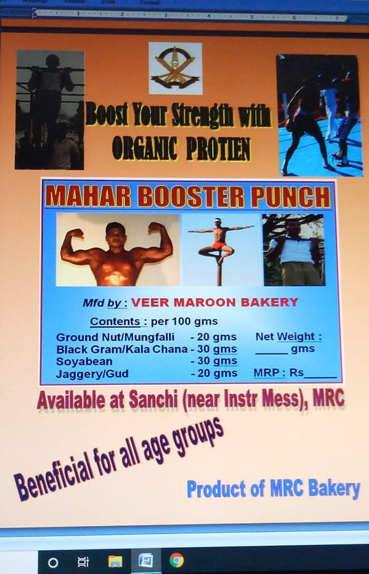
Before
Below is the existing design I was presented with. I know! my thoughts exactly!
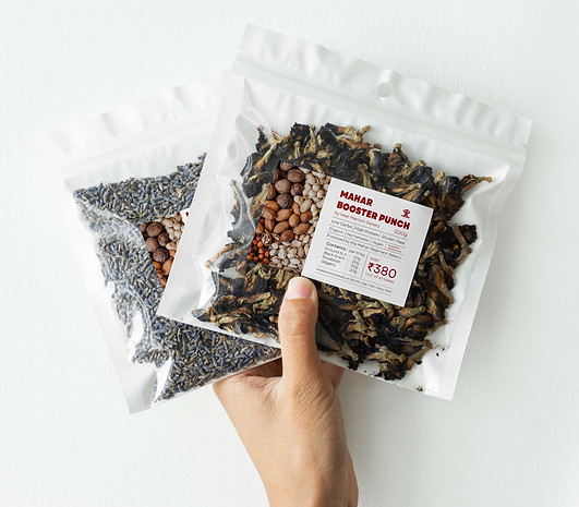
after
This is what I redesigned the product to. Sticking to the brief, the packaging is easy to comprehend, has all the information on one page, has no excessive colors, and is extremely minimalistic. The specific shade of maroon is chosen because it is the color of the brand.
closer look
A closer look into the design itself. with a simple, structured layout - sticking to the core principles of discipline of the brand - and a single side image layout, the design has preserved it's minimalism.

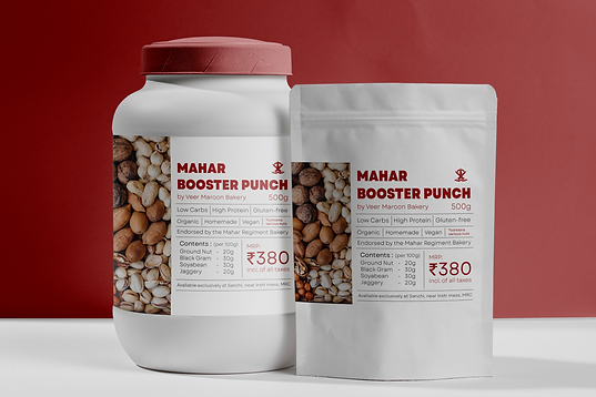
Label design
Since the primary design had to be placed on a packet, the label design mockup showed in more accuracy what it would end up looking like.